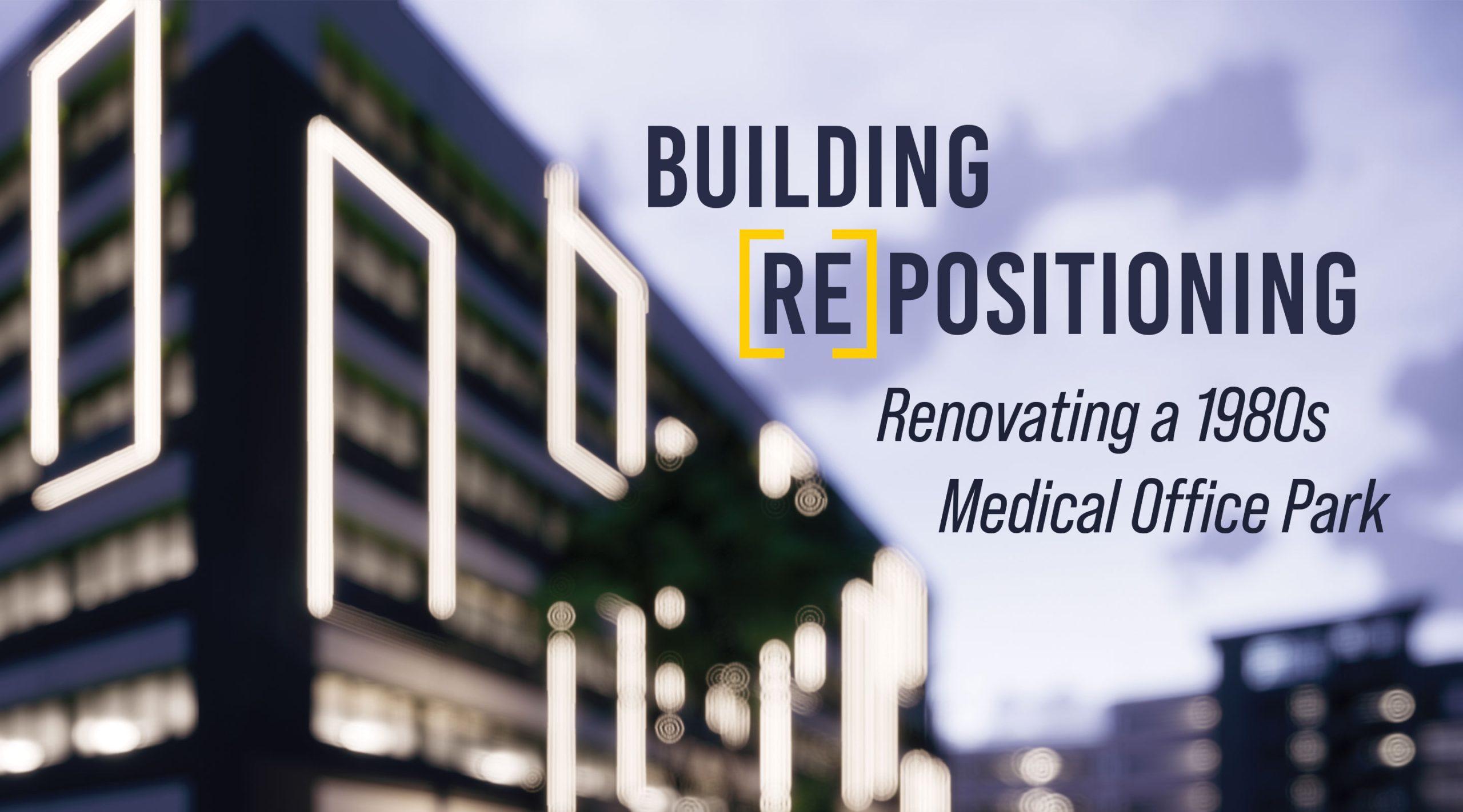
It all started with a frame —a way of seeing something in a different manner. For Cooper Carry, frames were the inspiration for a major office park repositioning project at what was once known as The Pavilion at Lake Hearn. Now branded as The Commons at Lake Hearn the modernized three-building medical office park features lush outdoor greenery, revitalized interior spaces, and an upscale grab ‘n go eatery. Medical tenants are lining up to sign on.
According to a 2012 survey conducted by the U.S. Energy Information Administration, half of all commercial buildings in the U.S. constructed before 1980 are reaching the end of their projected lifespan. Developers everywhere are looking at their existing buildings with fresh eyes and a focus on the future building and user needs of the space.
“Medical campuses in particular experience substantial foot traffic from patients and tenants alike and require additional measures to improve the overall experience,” said Brian Parker, Principal of the Interiors Studio at Cooper Carry. “The Commons at Lake Hearn is an excellent example of a post-pandemic medical office campus refresh, featuring new amenities and thoughtfully designed spaces to both enhance productivity and create a space where visitors feel safe, welcome, and healthy.”
To achieve a successful repositioning project, Cooper Carry brought together five of our design studios—Office Workplace, Interior Design, Landscape Architecture, Branding, and Experiential Graphic Design.
A Modern Take on a Suburban Office Park
The project started when the medical office park lost its parking garage, part of a city effort to widen the lanes on Interstate 285 so it would loop around the central Atlanta corridor. This roadway expansion would take the place of the existing parking lot, requiring a new one. Cooper Carry won this commission because of our expertise in medical office design and parking.
Located in “Pill Hill,” nicknamed for its concentration of medical facilities such as Northside Hospital and Children Hospital of Atlanta, the office park needed modernized facilities to meet the needs of today’s demanding marketplace. The client opted to expand the parameters of the project to include first two of the medical office buildings, 1110 and 1150, which were practically identical, and then the third 1200 building was added to the project. It differed from the other two buildings, with a split-level lobby, basement-level entrance, and a contrasting outer façade. Our goal was to create a cohesive look among all buildings.
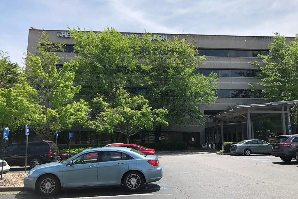
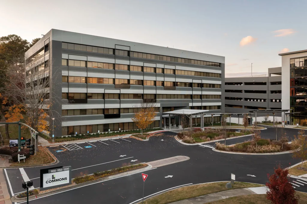
Inspired by the rooftop lights that originally lit the building during each holiday season, we decided to update the facade of all three buildings with lighted full and partial frames applied to the exterior to offer a geometric contrast. These new lights are not just white – we used RGBW lights with a variety of colors to draw the eye of passersby on I-285. While the lights provide a dramatic appeal to the exterior, they did not require a dramatic price and kept the exterior of the buildings from requiring a full refresh. The geometric detail of the frame inspired several design decisions inside the building as well.
Medical Office Building Interior Design
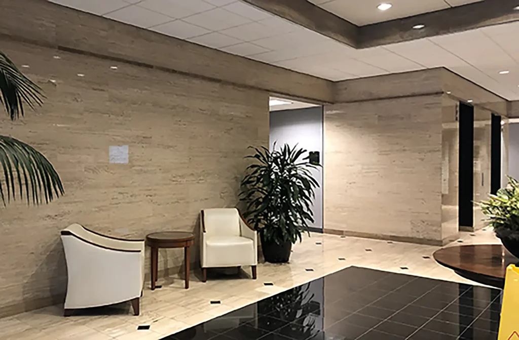
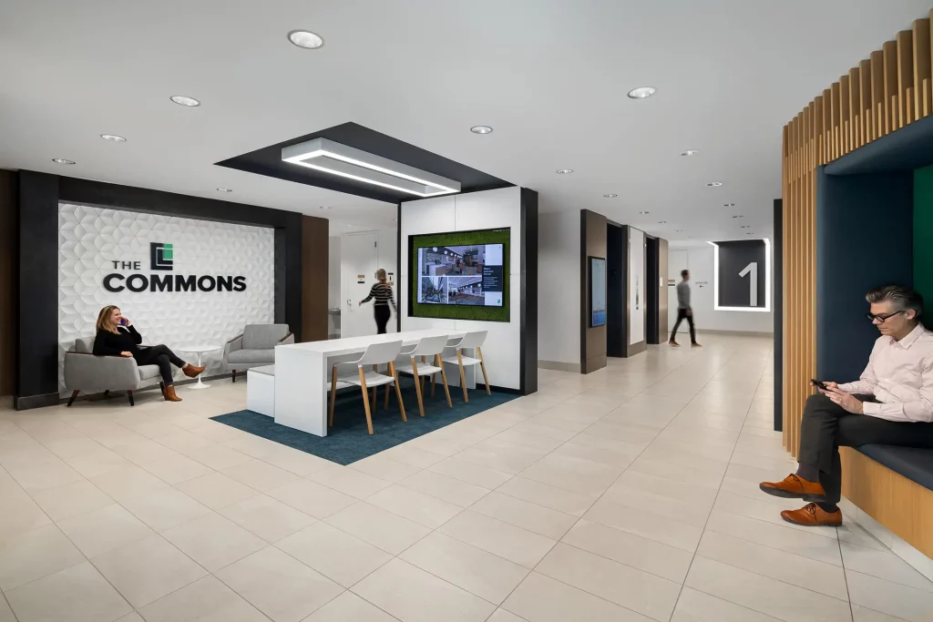
The Interior Design Studio at Cooper Carry wanted the new spaces to reflect the health and wellness theme of the property, especially one that would attract top talent in the area – only 30% of the buildings were leased at the start of the project. The studio added biophilic elements, such as natural wood and wood tones combined with preserved moss wall accents, to bridge the relationship between indoor and outdoor spaces. The lobby, once a space of hurried encounters and hasty conversations, was transformed into a coworking space with easily accessible technology and various seating options to encourage guests to linger. The studio integrated sustainability by re-using wood veneer panels in the upper levels and elevator lobbies. Metal frame elements at the elevator lobbies reinforce the design of the outer façade and connect to the canopy that runs between the buildings.
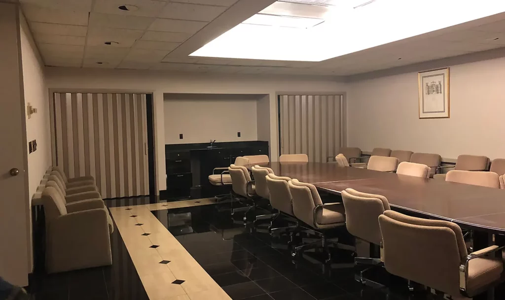
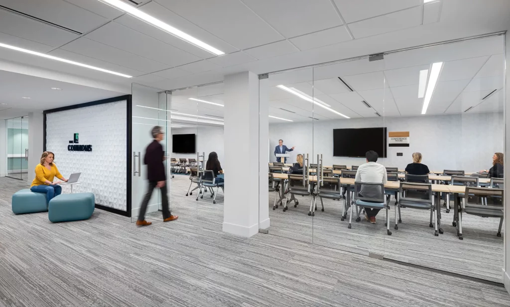
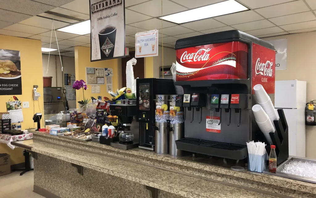
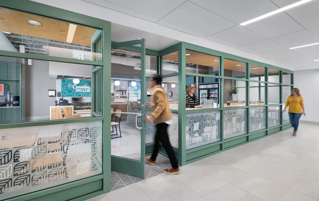
The outdated conference room that still boasted fluorescent lighting, a traditional circular table, and a white board was updated with modern technologies and flexible dividers to accommodate a group of 110 or two groups of 55. As the project expanded, there was an opportunity to fully update all areas and deliver on amenities for future tenants. This led to a complete overhaul of the original cafeteria, turning it into a commercial kitchen that provides meals for the new grab n’ go café, branded The Grille. Staff and visitors now have a place to enjoy lunch on campus, rather than walking or driving to other restaurant options in the area, which is difficult and time-consuming.
Using Landscape Design to Make a Big Impact on Building Repositioning
Parking lots and asphalt originally dominated The Commons office park, and the landscaping included overgrown holly and ivy, rusted railings, cracked paving, and worn furnishings. To create a wellness-inspired, attractive refresh, we first created an eco-friendly rain garden to alleviate some of the mustiness from once-overgrown areas. Existing trees were preserved wherever possible, but some had to be removed to open the space around the buildings for user amenities and to provide access for proper façade maintenance. All removed trees were replaced by calculated recompense strategies. We coordinated the flower options, so something is in bloom during each season. The porte cochere was repainted and re-clad to match the new pavers, creating a new and more welcoming arrival experience for visitors.
Exterior furnishings and shade structures provide guests with an additional place to wait comfortably for their loved ones, rather than waiting inside the medical buildings. Of course, Wi-Fi is accessible in all green spaces. The exterior landscaping has already become popular for wildlife, with the recent spotting of a goldfinch enjoying the new rain garden.
Reinforcing the New Brand
The full-scale renovation of the site required a new brand name to support it. The richly dense, green area surrounding the space and brilliant frames inspired this process. Over a six-week period, our Branding Services team led naming sessions with the client and found that a focus on nature and wellbeing in healthcare were powerful elements that drove the branding of the space. It was named The Commons to reflect the redesign of the property as a wonderful oasis in a sea of concrete parking lots and highways that surround it.
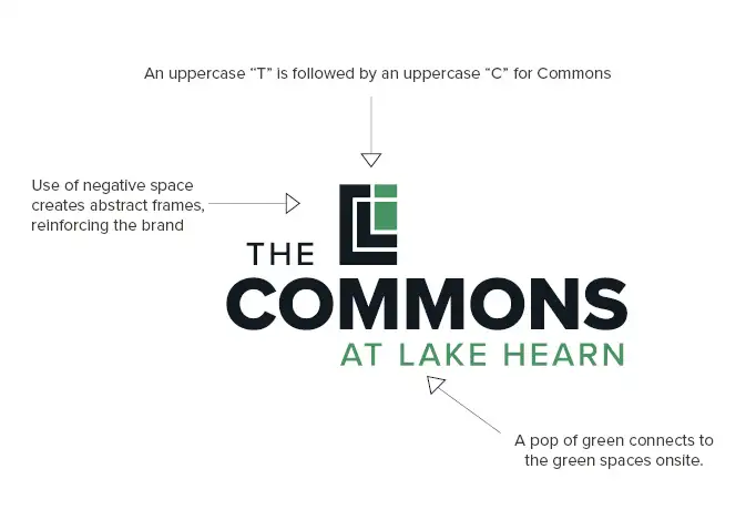
Our Experiential Graphic Design Studio infused the new brand throughout the spaces. Place-making graphics were a priority in this project, including replacing the ADA signage for enhanced visibility and legibility in the medical office. The studio also worked with the food vendor to create graphics for the menu board and exterior of The Grille. Each floor lobby includes oversized graphic features and floor numbers in the elevator lobbies to enhance wayfinding. Our work was positively received, and the client even brought in the studio to review and revise the parking garage graphics, when a previous chosen firm provided underwhelming results. Additional wayfinding was created to improve the user experience. Now, the multi-faceted medical office park exudes a singular voice and vibe.
The Results
Cooper Carry transformed this outdated medical office park into a reinvigorated campus for health and wellness.
“As the needs of patients and tenants continue to change, The Commons at Lake Hearn provides an enhanced in-person experience that is key in retaining existing tenants as well as attracting new, nationally recognized healthcare professionals,” said Scott Martin, Senior Vice President of SK Commercial Realty’s Office Leasing team.
Urbanize Atlanta reported that the renovations have attracted new tenants to the office park already, while existing tenants have renewed their leases. This repositioning is truly a success for all involved.
