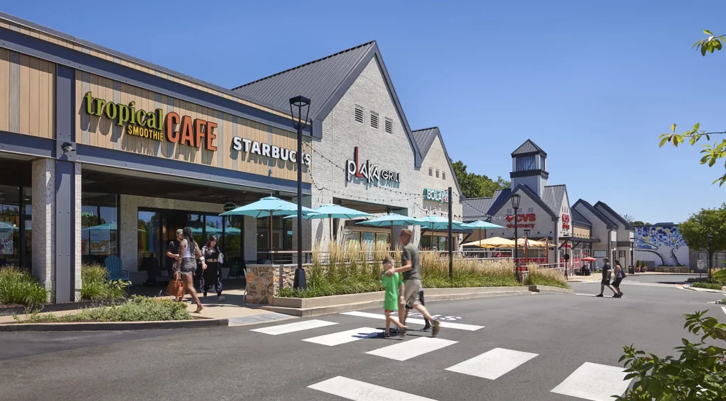
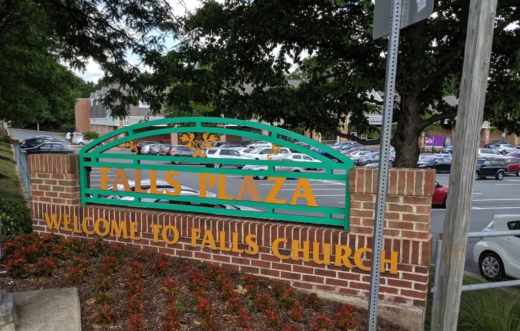
We take a deep dive into what it takes to make a retail repositioning project a success. Through a combination of our Architecture, Branding, and Experiential Graphic Design teams, Cooper Carry transformed Federal Realty’s Falls Plaza, a 1960s-era shopping center known as “the place with the Giant grocery store,” into Birch & Broad, a modern, refreshed space to shop, linger, and connect.
The Brief
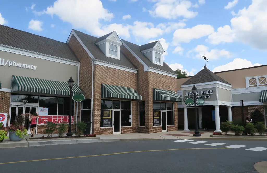
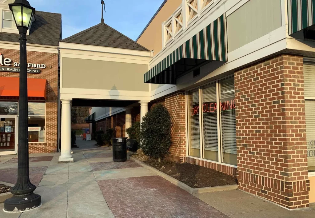
Falls Plaza was an outdated 11-acre community shopping center located along Broad Street in the West End of the city of Falls Church, a leafy suburb of Washington, DC. With reports from GlobeSt. touting the resiliency of grocery-anchored retail during the pandemic, refreshing the center was key to its continued success.
Grocery-anchored centers offer more visibility and foot traffic than other shopping centers, making them a good investment choice for developers,” said Samantha Bennett, Associate Principal in the Retail and Mixed-Use Studios.
Located adjacent to single-family homes and other commercial properties, the goals for the rebranding and improvements were grounded in transforming the space from a simple stop-and-shop center into a comfortable community space, where visitors would want to visit more often, linger longer, and connect with their neighbors.

The Challenge
The design and construction of Birch & Broad took place in a remote working environment during the height of the pandemic, and it was vital that the tenants at the shopping center remained open during renovations.
Unforeseen conditions brought unique concerns, as the base building drawings were not fully detailed and exploratory demolition was limited because of the open retail stores. When the design called for new aluminum canopies over the retail storefronts, the architectural team had to work closely with the structural engineer and general contractor to determine existing structural elements, their viability, and location from certain points on the exterior. Doing so ensured that the installation of the canopies was successful.
The safety of the retail tenants and their customers during construction provided another level of complexity to the project. During construction, ownership and the contractor worked closely with the retail store owners so they could remain open, yet offer safe pedestrian access. We implemented alternate routes with barriers and upgraded existing sidewalks to provide overhead protection at entrance locations.
As tenants often come and go, there was a need to address the question of ever-changing signage. The design team landed on Trespa and Stonewood panel systems, which could be switched out to individual panels without putting the rest of the system at risk.
The Rebranding
The new name for the property, Birch & Broad, is location focused. It originates from the streets Birch and Broad being the historical crossroads for the city of Falls Church. The new name also references the first council member of Falls Church, John Birch, while a wren sitting atop the plaza’s new signage pays homage to Colonel James Wren, the architect for Falls Church.
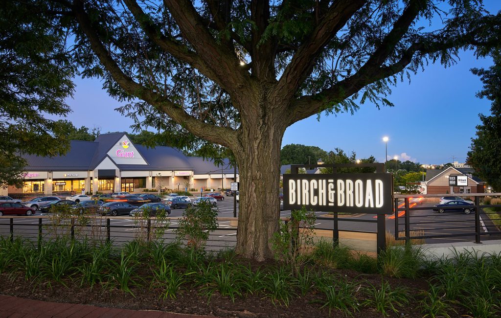
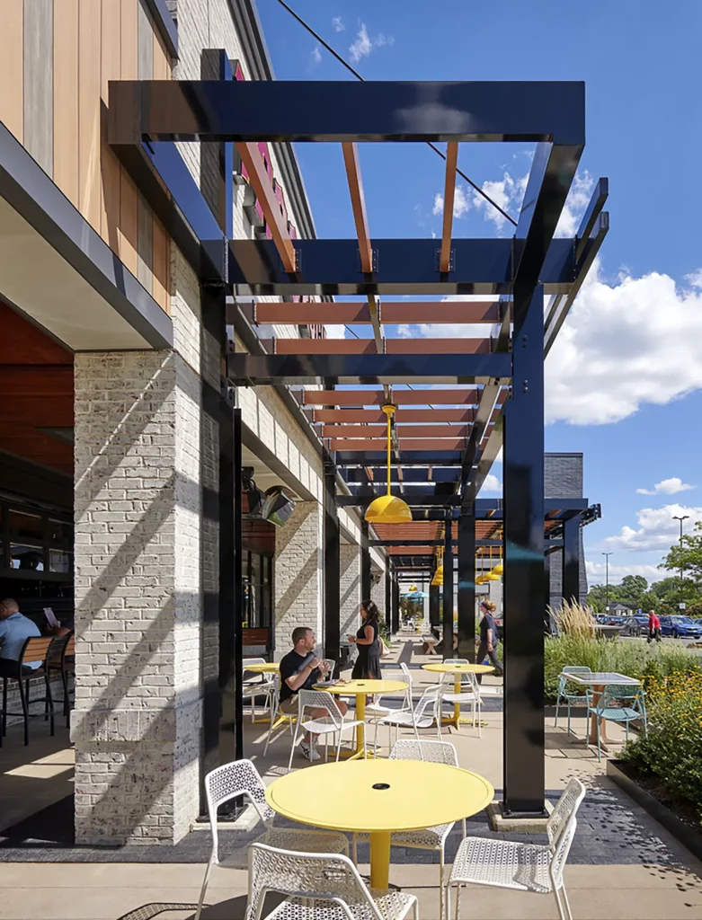
With a focus on elevating public open spaces and outdoor dining experiences, the center’s improvements provide a respite for families and students that engage with the center regularly. The brand tone and personality are welcoming, down to earth, casual, and familiar, reinforcing the project’s new farmhouse architectural style. Experiential graphics extend the brand through the space, with a family of wayfinding elements that draws visitors through the project, highlighting hidden destinations and retailers.
The Design
The ownership and design team worked with the city throughout the design and construction process. They were excited to see expanded outdoor dining areas, improved connective pedestrian experiences, and façade and landscape enhancements that embraced their vision. The existing center and its tenants are integral to the community and surrounding neighborhoods. The renovations encouraged even the grocer, Giant, to invest in their own interior improvements, further elevating the property.
The goal of the aesthetic design was to elevate the tired center and create a modern farmhouse look. The design team opted for varied materials that felt natural, warm, and durable on the façade like white-washed brick. The property is anchored by a new chimney, creating a hearth for the community to gather around.
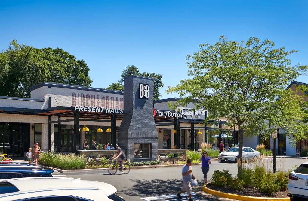
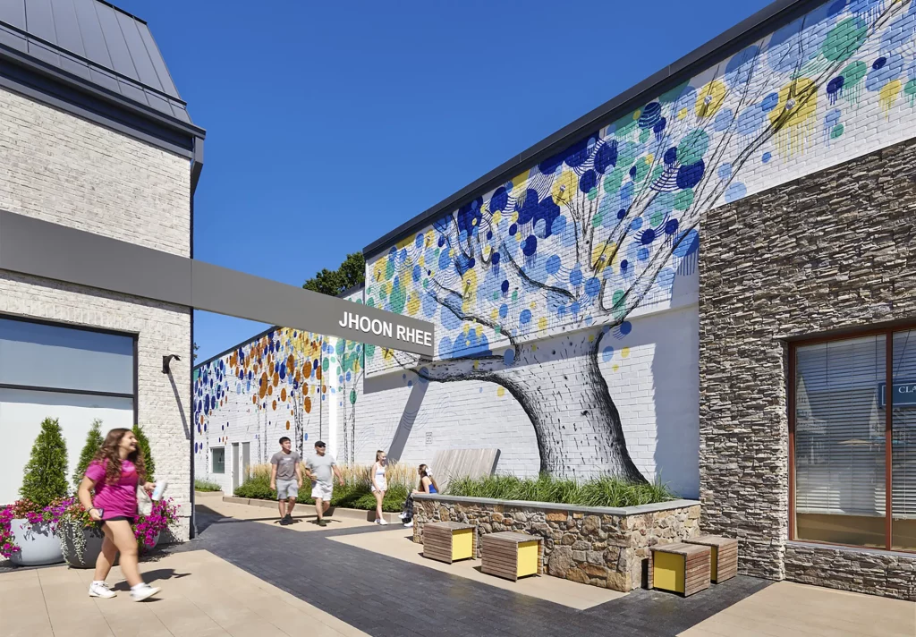
An emphasis was placed on pedestrian and bike access, given its adjacency to the Washington and Old Dominion Trail and the city’s goals to increase walkability throughout the West End. The design looked for opportunities to promote public art, which can be seen at the alley on the east end of the property. Development-branded murals by local artist BroCoLoCo are at both the west end and new east dining area. These bring a sense of whimsy to the alley and provide a perfect backdrop for enjoying the day.
One mural features a tree that appears to be growing out of a new planter designed by Studio 39, and the leaves are conveyed through a series of colorful graphic circles that stretch over the adjacent tenant and down the alley, pulling customers down the route. Key moments were created along the paths to the center, so pedestrians could take in the expanded outdoor dining area, retail alley improvements, and elevated storefront designs, such as along Wren Way, the renamed passage within the project.
The owner’s commitment to sustainability is evident in the redesign. Native plants like purple coneflower, Black-eyed Susan, switchgrass, and Carex were selected for their adaptive characteristics, suited to thrive in the development’s climate and enhance the local ecosystem. These plants provide nectar, pollen, seeds, or shelter for native wildlife. We installed vine trellis systems on many columns to provide a vertical planted element, offering both visual interest and shade to help lessen the urban heat island effect from paved areas. Other environmentally friendly features and practices include LED lighting, bike parking, green cleaning products, EV stations, and tenant sustainability guidelines for fitting out their spaces.
The Results
We’re really, really happy with the way it turned out,” said Jay Brinson, Vice President of Development, Federal Realty Investment Trust. “We think the investment that we made in public spaces and gathering spaces is exactly where retail’s going.”
The project reopened in late December 2021, and Birch & Broad continued to add new tenants, becoming fully leased less than six months later. Some of these were family and fitness-oriented businesses, such as The Little Gym, Aqua-Tots, and Conte’s Bike Shop.
The renovation and rebranding of Birch & Broad reinvented the center by providing appealing outdoor amenities that are attractive to both customers and retailers,” said Deirdre Johnson, Senior Vice President of Asset Management for Federal Realty, in an article for Patch.
The project won the 2022 Associated Builders and Contractors Metropolitan Washington and Virginia Chapters for the Excellence in Construction Award, Retail. It also won the 2022 NAIOP Northern Virginia Capital Improvement Non-Institutional Award of Excellence. Cooper Carry continues to work with Federal Realty, with a new repositioning project debuting in 2023.
Interested in learning more about how Cooper Carry successfully repositions a project? Check out our LinkedIn article on the subject.
