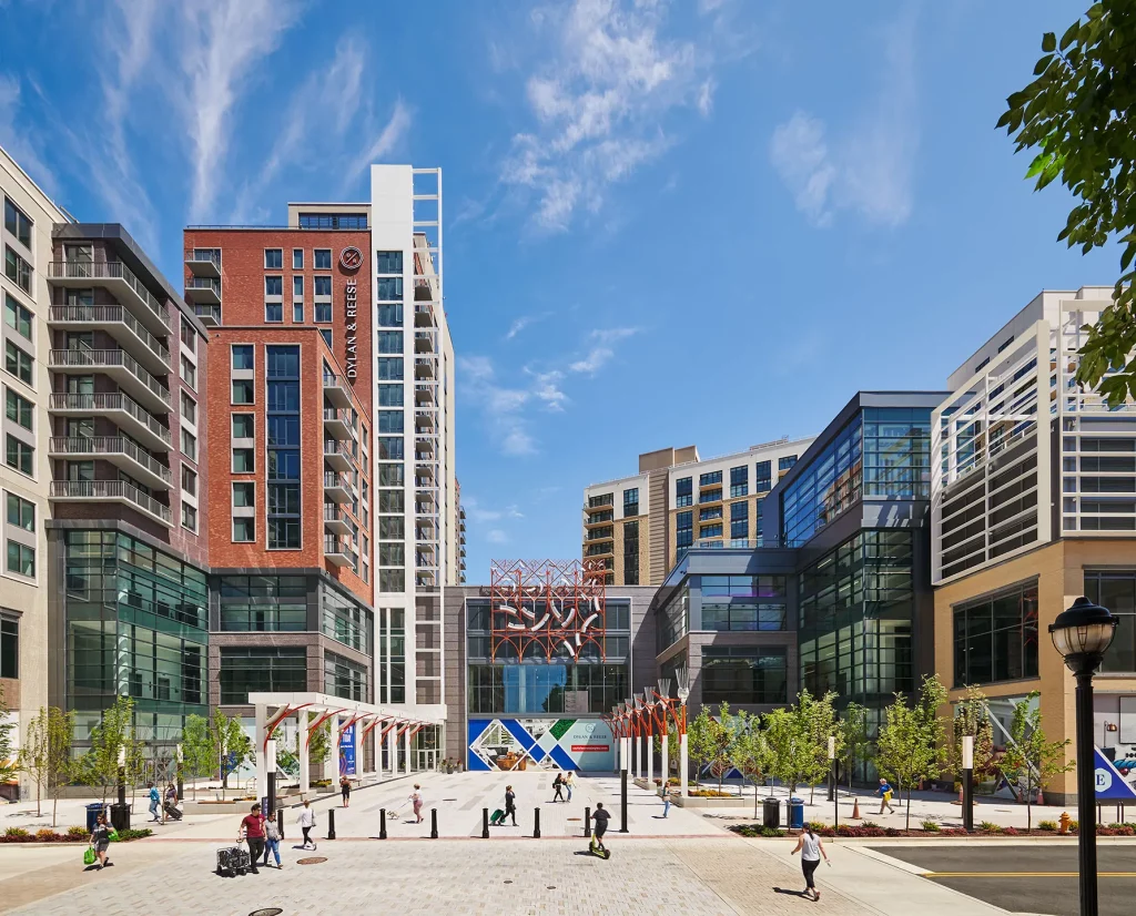
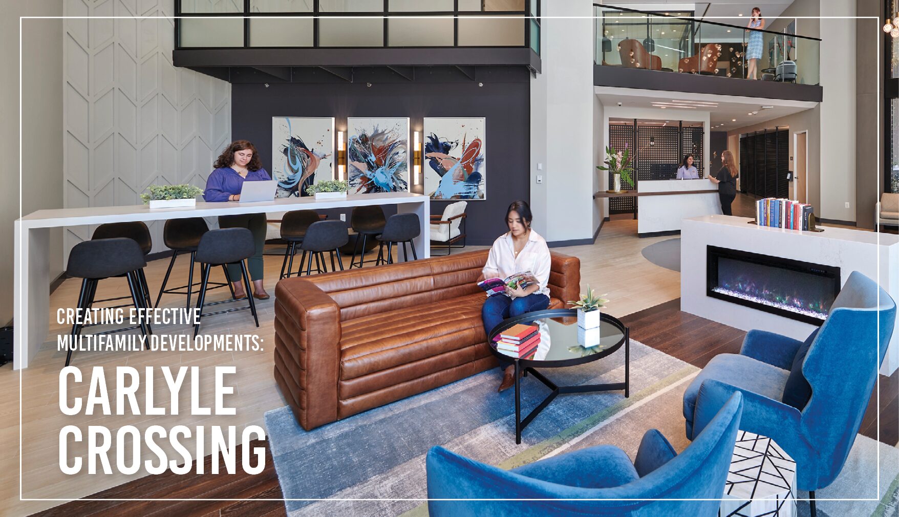
Located just outside of Washington, DC, Alexandria boasts a bustling historic area; however, the suburb is home to many under-utilized, surface-level parking lots. Cooper Carry designed Carlyle Crossing to breathe life to this latter space and facilitate long-term growth by creating a burgeoning new community, with walkability, varied residential options, retail, and grocery.
Planning and problem solving become paramount when building a massive multifamily-anchored development with over 210,000 gross square feet of retail. Here is how Cooper Carry managed the common issues that came up in the design and construction of Carlyle Crossing.
Problem: Mitigating the Massive Size of the Mixed-Use Development
Solution: Different Exterior Materials and Open Spaces to Break up the Scale
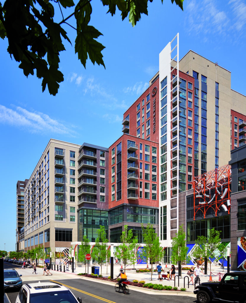
With a total of 1.7 million square feet, our design team, which included the Multifamily Residential, Interior Design, and Experiential Graphic Design Studios, decided to break up the style of the buildings at Carlyle Crossing to provide varying experiences as users navigated the site. Different expressions were formed at each of the buildings. For example, one tower at the end of the block features blonde brick with dark metals, contrasting with red brick and gray accents on another building.
We used brick-clad precast for the building skin to save time in the construction schedule. Project Manager Alysha Buck explains,
While precast has long been used in the design of office buildings, it is not yet common in a residential typology. We had to take care in detailing around the windows, to account for the higher level of comfort and higher humidity expected in a multifamily environment. But choosing a brick-clad pre-cast material allowed us to save several months of construction time on this project.”
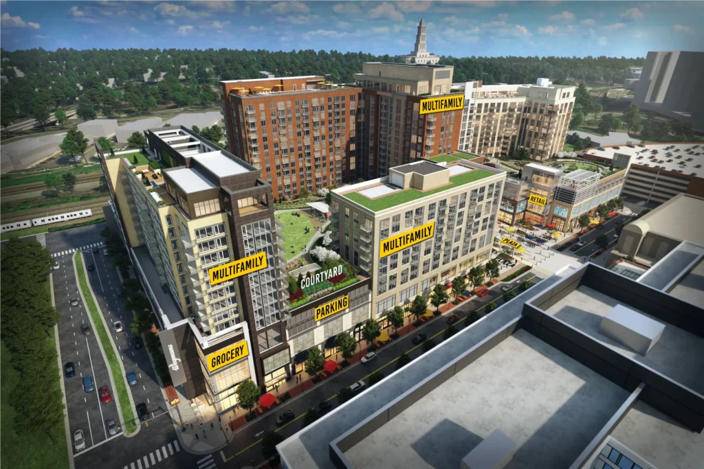
To mitigate the size of the project and keep the area pedestrian friendly, Wegmans Food Market, the grocer, was moved to the third floor of the complex, allowing for smaller retail options at the ground level as well as plenty of sidewalk space for visitors and residents. The back side of the grocer footprint was still coordinated to meet grade, allowing for truck and service access points at the same level as the store. Residents and general shoppers can access the store via dedicated elevators and escalators. Read more about how Cooper Carry successfully integrates grocery into mixed-use developments.
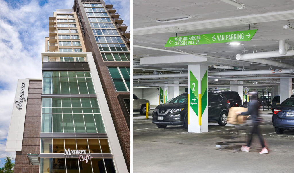
Cooper Carry’s Experiential Graphic Design Studio provided wayfinding and signage to ensure users could easily navigate the development. Each of the three towers has a distinct look which helps express their unique brands – Dylan, Reese, and Easton – but also ties them together as part of Carlyle Crossing. In the main garage, bright colors and angular shapes inspired by the brand mark were integrated into wayfinding throughout the complex. Patterned murals further infuse the brand identity and became wayfinding cues at key vertical transportation areas.
The massing of the buildings allows the sidewalks to be pedestrian friendly, encouraging walkability in the community and to the nearby Eisenhower Metro Station. A central plaza allows residents and visitors a space for relaxing and open play. It is also used for gathering events like local concerts and film screenings, which further community building. To continue the park-like feel, signage and wayfinding integrate into the hardscape and landscape.
Problem: Adding Hundreds of Apartment Units to the Market at Once
Solution: Creating Three Unique Branded Towers
Carlyle Crossing brings the redevelopment of the area to critical mass, with 741 residential units provided over three towers. The design team needed to be strategic when introducing such a large quantity of units to any market, not to cause any one portion of the building to be competing against the others. At Carlyle Crossing, the team established a distinct target market for each of the three residential towers and customized the design to appeal to each user group. Cooper Carry provided interior design for the Dylan tower, while Hartman Design Group provided services for the Reese and the Easton towers.
The Reese and Dylan towers appeal to a young, hip resident – with a Zen-inspired interior design at the Reese, and a vibrant and energized interior at the Dylan. The Reese units focus on studio and one-bedroom options, tailored to younger singles and couples. The Dylan units appeal to younger families, offering many two-bedroom options with “dens,” which are slightly smaller bedrooms that can be flexibly used as office space or a child’s bedroom. This building also features direct access to one of the playground areas at the two-acre private park.
In contrast, the Easton offers upscale boutique luxury, catered to a more mature and established demographic. Most units have an entry hall, with a walk-in mudroom, a luxury that instantly gives an elevated feel since there is separation from the living room.

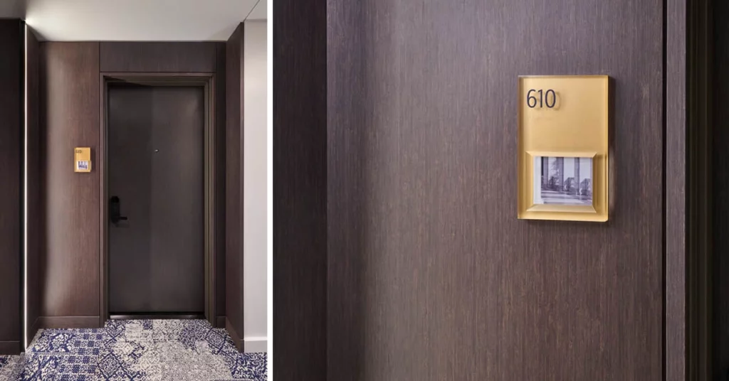
Brand differentiation extended to the wayfinding and signage at the property. While cohesive with the Carlyle Crossing brand, each building features unique signage and wayfinding elements. At the Easton, we used luxurious materials and finishes to coordinate with the interior palette for this upscale residence. Contemporary elements, like clear, cast resin mimic glass, while small photos of local landmarks were inserted into frames to make identifying units more personal. Forms for the signage were inspired by classical elements, like millwork and trim, combined with monochromatic materials for a more modern style. At Dylan and Reese, wood elements combine with contrasting textures to add a natural, serene, minimalist approach to the space. At Dylan, wood with brushed aluminum creates a subtle reflective surface to which an abstracted print of an abalone shell creates a biophilic, yet artistic reference to water.
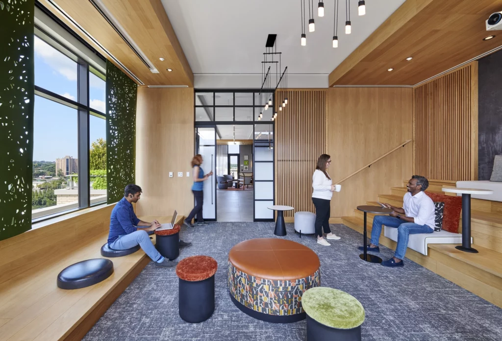
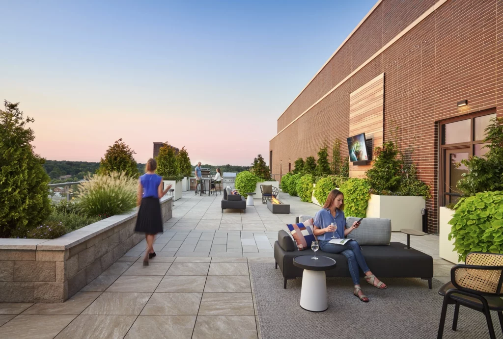
Multifamily amenities are key, especially for groups like Gen Z. In addition to co-working spaces, each tower offers a rooftop terrace as well as a fitness center so residents can spread out. The rooftop coworking space in the Reese operates like a TED-talk style hall, with flexible terraced seating to comfortably work remotely. At the Dylan, the conference rooms can be reserved for large meetings during the day, though many families have also utilized the rooms as spaces for the child residents to do homework in the evenings. Additional amenities like a rooftop pool, two pet spas, and mailrooms with package and dry-cleaning lockers, are all tied into an app to provide seamless accessibility.
The outdoor public areas offer benches for seating, and native plants and grasses were chosen for their visual appeal and to minimize water usage. Green space also abounds on each rooftop, which not only provides another touch-point with nature for the residents but also helps to mitigate heat island effects.
Problem: Bringing in Profits During Lease Up
Solution: Creating Short Term Rentals
It can take at least a year for a multifamily property to fully lease up. To help generate income in the meantime, the team at Carlyle Crossing incorporated several stories of short-term rental units into one of the towers. Through a partnership with Placemakr, a tech-enabled hospitality platform and operator, more than 100 units at the Dylan were converted to short-term rental units to provide an alternative to traditional home-based booking sites like Airbnb.
The “pop-up hotel” integrates with the main residential areas, which activated the site before the towers were fully leased. The hotel prompted positive feedback about the hustle and bustle of the lobby spaces, and hotel guests can get a true understanding of the vibe of the area by being intermixed with residents. The hotel has remained at full occupancy almost the entire time it has been open. Security on property is managed through an app that allows residents to use their phones for access to various areas of the building, so the hotel does not impede on their safety. Similarly, this technology makes it easy for residents and hotel guests to have access to appropriate amenities.
The Results
Since its opening in Fall 2022, Carlyle Crossing continues lease up, and activities and gatherings throughout the year have beckoned visitors to the site since it has opened. The excitement continues to grow, with new retail moving in like Atlas Brew Works, Ted’s Bulletin and Sidewalk Bakery, Celebree Daycare, and District Dogs.
Carlyle Crossing’s success has been recognized by the Associated Builders and Contractors Metropolitan Washington and Virginia Chapters, winning the 2022 Excellence in Construction Award, Concrete Award of Excellence.
Ready to create the next multifamily mixed-use destination? Let Cooper Carry help you navigate the complex process and realize your vision.
